Instant Savings
 Support
 Find a Dealer
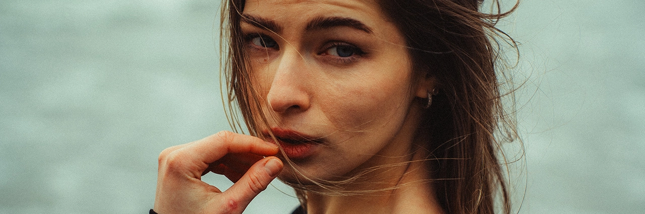
What You Will Learn in This Color Grading Post:
As a photographer specializing in portraiture and lifestyle, I’ve embraced the use of visual storytelling. I remember being in college when my instructor showed us the importance of color in visual media that creates tone, mood, and style. Over those years, I’ve studied how color plays a big role in movies, drawing inspiration from filmmakers Christopher Nolan, Hayao Miyazaki, and Wong Kar-Wai.
What You’ll Learn In This Post:
- How to define your mood and style through color grading techniques.
- The importance of using references, from films to photography, to inspire your color choices.
- How to experiment with Adobe Photoshop or Lightroom tools like color grading, tone curves, and color balance.
- The impact of effects such as film grain and dehaze in enhancing your images.
- Why embracing imperfection can make your photos feel more cinematic and unique.
By Guest Contributor Dylan Dufault
During the COVID-19 pandemic in 2020, I taught myself color grading while honing my photography skills professionally, utilizing Lightroom techniques to create stunning images. I consider color grading to be a “piece of the puzzle” that shapes the mood and tone of my photos and creates “poetry” without words. While I use digital photography, I also have a deep admiration for vintage film aesthetics.
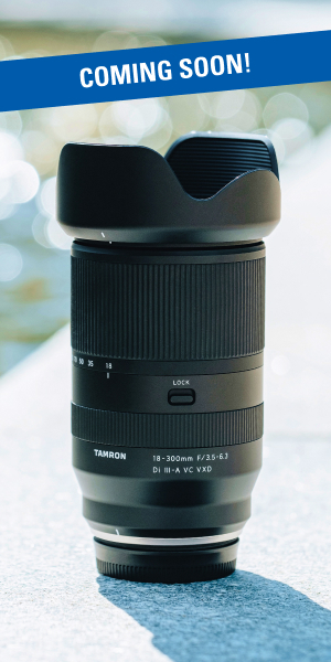
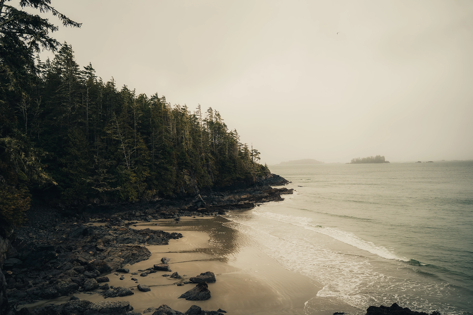
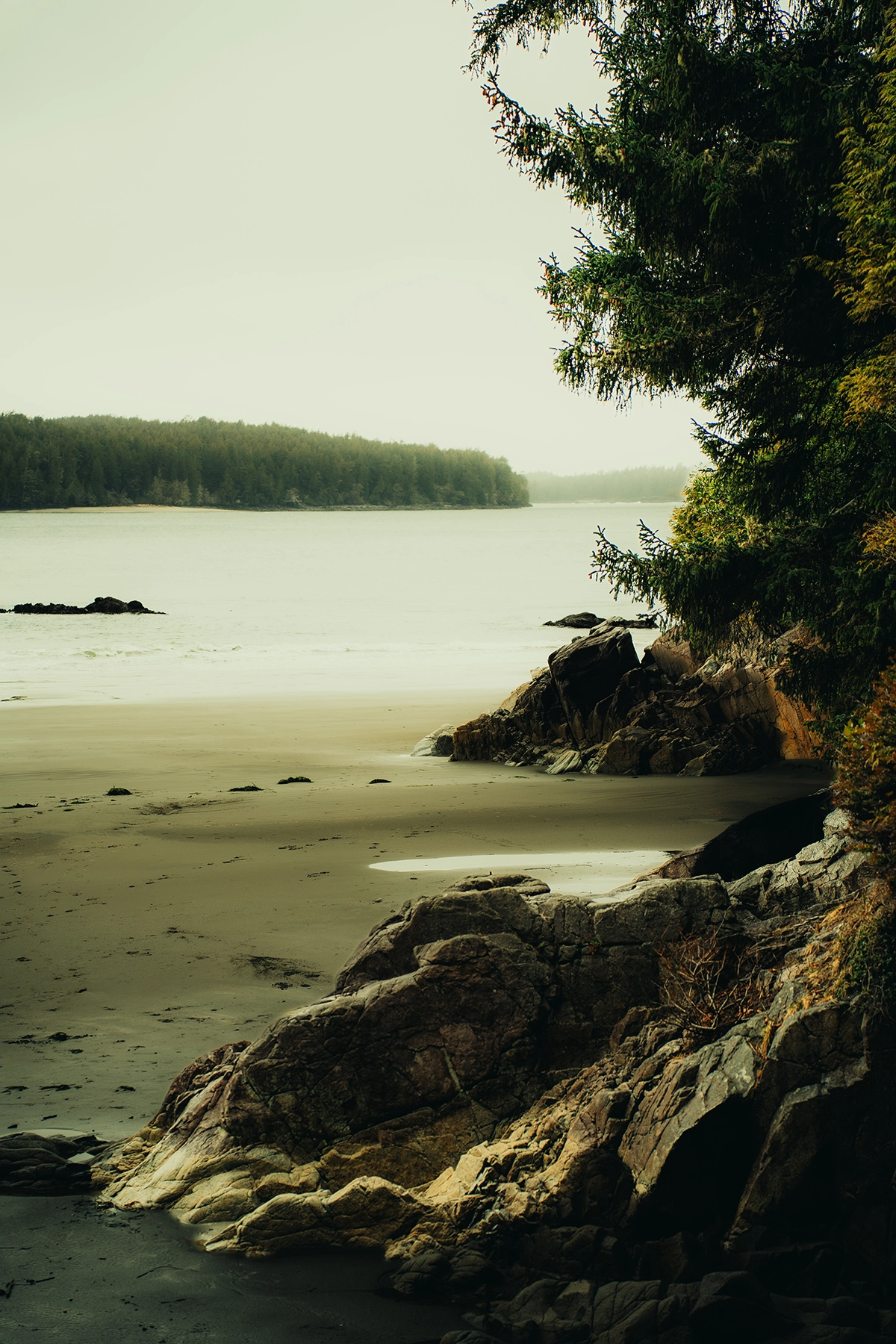
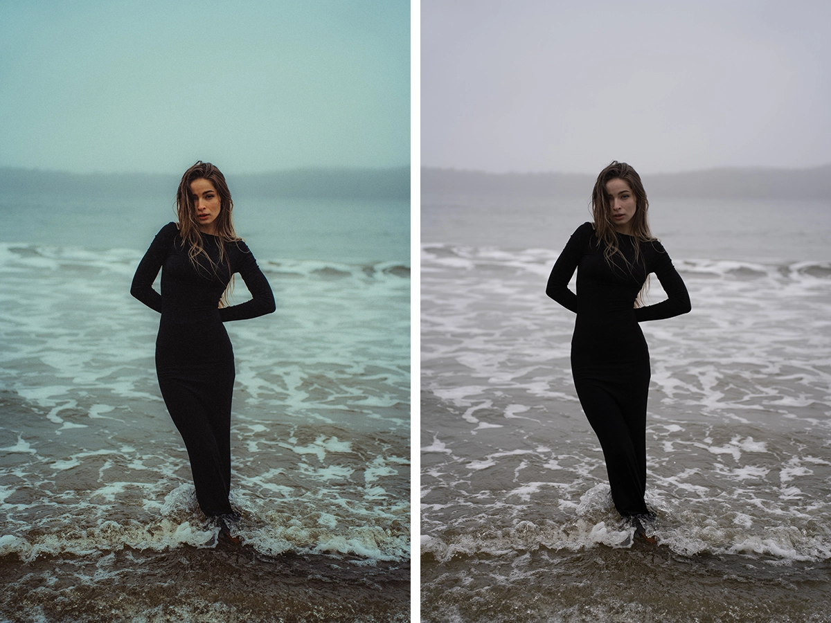
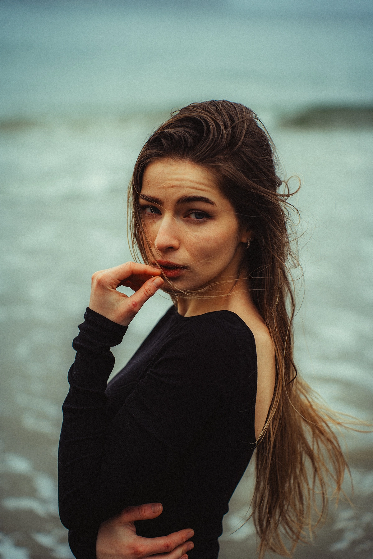
To achieve the Kodak film look, I match the grain size and blend it with vibrant, rich colors for an authentic vintage aesthetic. During a recent work trip to Tofino on the west coast of British Columbia, Canada, I played around with color grading to enhance the misty, rain-soaked landscapes and the waves tiding into the water shot with my Tamron 28-75mm F/2.8 Di III VXD.
With six years of experience as a photographer, I want to share key insights on the importance of color grading in photography. The first and most essential step in my process is defining the mood and style of an image, setting the foundation for impactful storytelling.
TIP 1: Use Color Grading to Define Your Mood and Style
For every photo I take, I try to determine the mood and style I want to achieve. Here’s how I approach it:
- Study others’ work: Look at photographers, filmmakers, and artists you admire to understand their color choices.
- Create a mood board: Gather images that inspire you and help visualize your desired aesthetic.
- Use Adobe Color: Find the perfect color palette, such as the Three-Color Method, to guide your editing.
- Experiment in Lightroom: Adjust mid-tones, saturation, and highlights to fine-tune your look.
- Blend styles: Try mixing a slightly overexposed cinematic look with vintage film grain for a dreamy effect.
- Embrace trial and error: Some of my best photos came from happy accidents—unexpected lighting, color shifts, or compositions that worked beautifully.
I’ve always drawn inspiration from animated films, particularly Studio Ghibli classics like My Neighbor Totoro and Princess Mononoke, which use softer highlights and rich mid-tones. This leads us to my next tip: references.
TIP 2: Find Color Grading References That Inspire You
When working on a new project, I draw inspiration from various photography and film sources to refine my style while keeping it uniquely mine. Here’s how I use references in my color grading process:
- Look beyond photography: Books, films, and other photographers’ work can provide valuable insights into light, contrast, and color balance.
- Analyze visual storytelling: Study how filmmakers and photographers use texture and tones to evoke emotions.
- Use film and photos as guides: I reference specific images and movie frames to help set the mood for my color grading.
- Create a mood board: Gather images, movie frames, and even music that align with your creative vision.
- Explore different inspirations: For my Tofino photos, I drew from Normal People (Hulu mini-series), Kodak Portra 400, and the works of Ippei & Janine Photography.
- Remember that references are guides: Your final photos don’t have to match your inspiration exactly—experimentation and reworking are part of the creative journey.
By blending various influences, you can develop a strong color grading style while making it your own.
TIP 3: Practice, Experiment, Repeat
If you are a beginner in photography, consistent practice and experimentation are essential to improving your skills. Here’s how I approach it:
- Master the fundamentals: Learn image aesthetics such as composition, lighting, and framing to develop your unique style.
- Refine your editing process: Your niche will influence your post-production choices, so experiment to see what works best.
- Use natural elements: For my Tonquin Beach portraits of Anastasiia, I utilized diffused rainy clouds to create soft, natural light.
- Focus on three key aspects in post-production:
-Light: Adjust contrast, highlights, and shadows using Tone Mapping or Curves in Lightroom to enhance the image.
-Color: Experiment with color balance, the color mixer, and color grading tools to create a specific mood.
-Effect: Add stylistic adjustments like grain, texture, or dehaze to enhance depth and character. - Experiment with color grading techniques:
-Use cooler tones to enhance the blues and aquas in the water.
-Adjust reds for skin tones while toning down warm hues.
-Inspired by Terrence Malick’s The Tree of Life, I incorporated green color in the midtones and increased highlights while keeping shadows warm. - Create a cinematic feel: The right balance of light, color, and grading can help your photos stand out while highlighting the subject’s best qualities.
The more you experiment, the better you’ll understand your own style. Keep refining your approach through trial and error.
TIP 4: Make Use of Color Grading Effects (Film Grain, Dehaze, etc.)
One of the best tools in Adobe Lightroom ‘s editing software is the Effects panel, which allows for subtle yet powerful adjustments. Here’s how I use it:
- Explore different effects: Adjust texture, dehaze, and clarity to enhance image details.
- Use grain for a film-like look: My favorite effect is grain, which adds texture and a nostalgic feel.
- Draw inspiration from Kodak films: I replicate the look of Portra 400 (120mm), Gold 200 (35mm), and Vision3 250, known for their rich textures.
- Sharpen strategically: To make subjects or landscapes stand out, I increase grain to around 40 while keeping the size between 15 – 25.
- Combine effects with color grading: When used together, effects and color grading help set the mood and enhance depth.
- Create emotional impact: Thoughtful editing gives your images a unique character that resonates with viewers.
Creative editing is all about freedom—crafting your tone and making images that evoke powerful emotions.
TIP 5: Embrace Imperfection: Break the Rules in Color Grading
In photography, rules are often taught as guidelines, but the most striking images come from pushing boundaries. Here’s how you can break the norms and create more expressive photos:
- Challenge traditional color mixing: Experiment with clashing colors in the mixer instead of sticking to standard color harmony.
- Play with highlights and shadows: Try off-tones to create a unique mood, don’t be afraid of unconventional contrasts.
- Adjust exposure creatively: Overexpose or underexpose intentionally to achieve a dramatic or surreal effect.
- Forget about making images “clean”: Stock photos focus on perfection, but storytelling thrives on character and imperfection.
- Think of color grading as an art form: It’s like telling poetry without words or painting without a brush, it’s all about emotion.
- Draw inspiration from visionary photographers:
- Annie Leibovitz: Known for her candid portraits and evocative storytelling.
- Garrett King: Masters high contrast, vivid imagery, and an analog film aesthetic.
- Use framing and effects to enhance the story: Every choice in color grading, effects, and composition contributes to the feeling behind the image.
True creativity comes from breaking the mold—experiment, trust your instincts, and make images that stand out with emotion.
Final Thoughts on Color Grading as a Tool to Convey Mood, Style, and Emotion in Photography
Color grading is one of my favorite tools in the age of digital photography. This important post-production tool creates these important moods, styles, and emotions.
I believe Lightroom Presets could be included in future cameras to make it easier for the editing process, just like what certain cameras are doing for film emulations and inserting LUTS.
By experimenting with different techniques, drawing inspiration from various movies, photographs, and other creators, and embracing the beauty of creativity, storytelling in photography helps create poetic images that resonate with viewers.
Keep creating and don’t be afraid to break the roles. As I said, color grading is an important “piece of the puzzle.”